Brooke Hall
Design specialist passionate about customer experience, design thinking and research
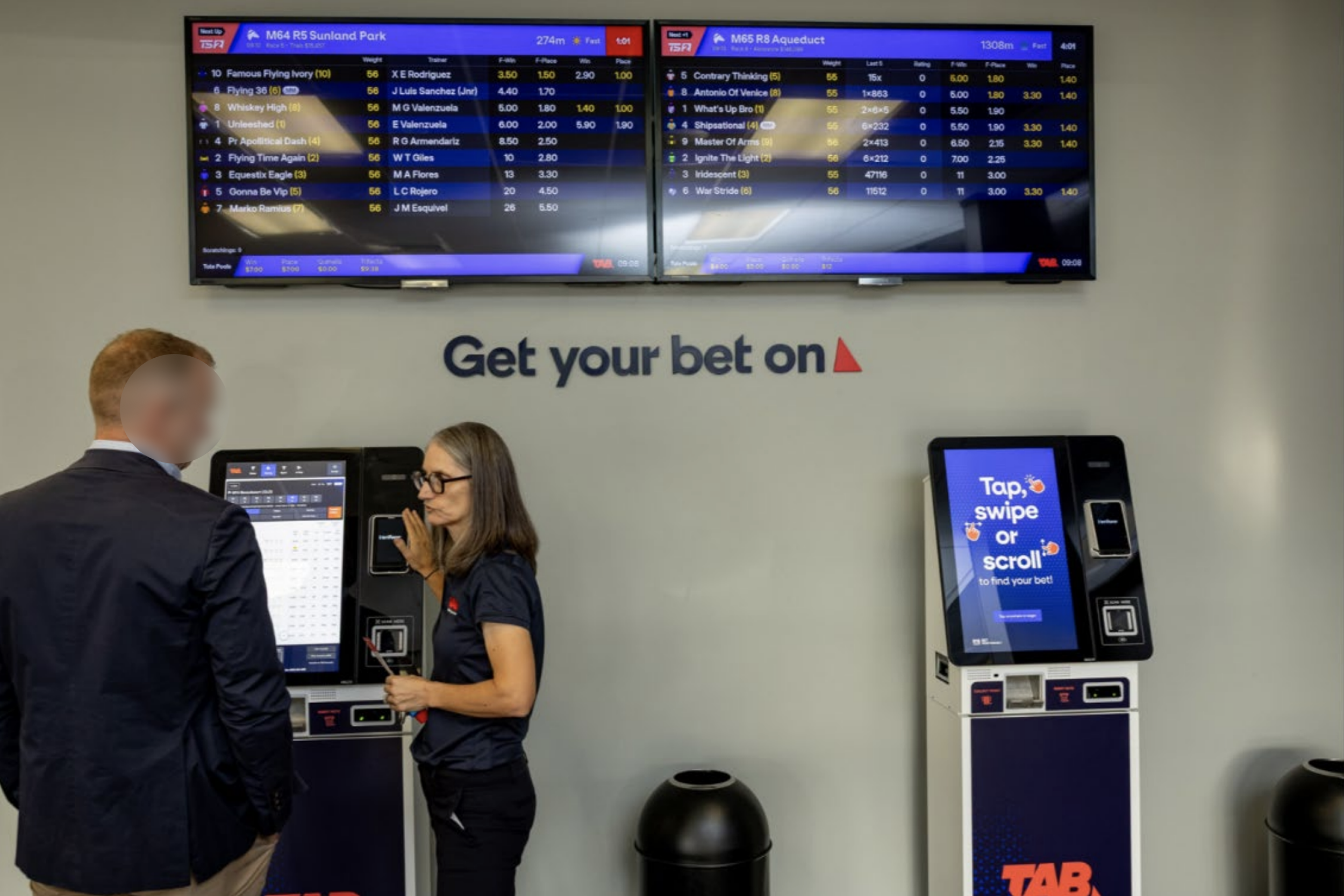
Elevating TAB New Zealand’s retail experience
Bridging the gap between physical and digital wagering to create a seamless omni-channel user experience and increase digital in-venue sales by 12%
Challenge: TAB NZ’s in-venue betting experience lagged behind its digital channels, creating inconsistency, friction and a disconnect for customers moving between the app, website and retail. How might we modernise the retail experience to match the speed, usability and engagement of TAB’s online platforms while retaining the excitement of in-venue wagering?
Solution: A modern redesign of a next-generation in-venue terminal and media experience that mirrors the intuitive design and functionality of TAB’s app. Through UX research, prototyping and iterative testing, we created a unified omni-channel ecosystem that elevates usability, accessibility and engagement.
Role: Senior UX Researcher

The context
Entain Australia and New Zealand is one of the nation’s leading online wagering providers and is the home of Ladbrokes, Neds, Entain Venues, TAB New Zealand, Betcha and Trackside. Following the rebrand of TAB in early 2024, the retail modernisation initiative aimed to deliver a world-class betting experience for customers in physical retail venues by upgrading retail displays (RID) and Self-Service Terminals (SST) across more than 450 TAB venues and 50 racecourses across the country.
The insights from the design thinking-led discovery phase and multiple rounds of iterative user testing helped the business understand the varying media needs of customers attending venues and the improvements that were required to media screens to enhance the overall betting experience, and ultimately delivered an impressive omni-channel experience that connects our digital experience with the in-store experience.
The problem
TAB has been an iconic brand in NZ for over 70 years, built around the passion Kiwi’s have for sports and racing. Prior to Entain’s strategic partnership with the brand in 2023, TAB was challenged by legacy systems and processes which created friction in the customer experience - this highlighted a significant opportunity to not only migrate the TAB tech platform to Entain’s modern tech stack but to conduct extensive customer research to understand what improvements could be made to enhance the in-venue betting experience.
Below outlines the key digital touchpoints that form the retail betting experience in TAB venues:
| Self-service terminals (SST) | Retail information displays (RIDs) |
|---|---|
|
|
The betting terminals were slow, outdated and intimidating particularly for occasional bettors during major sports and racing events such as Melbourne Cup day, often being referred to as the slowest form of betting by punters.


The following were the key issues associated with the legacy retail experience:
| Self-service terminals (SST) | Retail information displays (RIDs) |
|---|---|
|
|
TAB’s migration to a more modern tech stack enables the business to test and develop solutions to address customer pain points and quickly introduce those changes to the platforms. The new retail terminals and media displays mark a major milestone in delivering an outstanding experience for TAB customers across all channels, providing more products, markets and features to better meet the demands of today’s dynamic wagering landscape.
The objective
We commenced the research for the retail uplift program at the beginning of 2024 with the primary objective of not only iteratively testing terminal and retail information display design concepts with customers throughout the 12 month period, but to also conduct an in-depth ethnographic observational study to observe the real-world circumstances in how retail touchpoints are used, understand what factors influence customer’s behaviour in-venue, identify pain points and highlight design opportunities.
I facilitated a kick-off workshop with key stakeholders and SMEs from Product, Design, Tech, Trading, Finance and Retail teams to:
Define the scope of research
Identify dependencies and risks
Define and align on key research objectives
Discuss proposed research methods
Define project success metrics
The key objectives for the retail uplift project and research initiative included:
Replace all retail wagering terminals with market leading hardware and software to improve the customer experience
Update odds display templates with richer insights, more call-to-action content and modern displays
Update digital eForm displays with more intuitive navigation and content presentation, and replace paper form in venues with interactive touchscreen displays

Research kick-off workshop with stakeholders and SMEs to discuss and align on project objectives, scope, goals and proposed research plan, and to identify any risks or constraints
The approach
As a Senior UX Researcher on this project my role was to lead the more complex research initiatives for the retail uplift project and support the Product and Design teams to conduct usability testing for their streams of work. I encouraged a ‘guess early, test early, learn early’ mindset within both the team and embedded research as a core driver of design and product decisions over the project’s 12 month span.
Key responsibilities
Led and scaled research programs across seven rounds of exploratory and evaluative studies (qualitative, quantitative, behavioural, attitudinal), gathering learnings from over 460 participants to uncover actionable customer insights
Owned end-to-end research delivery from planning, scoping, methodology, discussion guides and fieldwork, through to synthesis, storytelling and executive-level presentation of findings
Facilitated research planning and prioritisation, aligning teams on objectives, hypotheses, research questions and the highest-risk journeys to focus effort and maximise impact
Utilised diverse research methods including in-venue ethnographic study, usability testing and surveys, ensuring insights reflected real-world customer behaviour
Leanly distilled complex insights into actionable findings through collaborative synthesis sessions enabling the Design team to rapidly iterate and implement improvements throughout the project
Created detailed reports for more in-depth studies and delivered one-page summaries that translated complex findings into clear, actionable recommendations
Delivered credible, trusted insights that bridged the ‘say–do gap’ and acted as a strategic partner to Product and Design teams, ensuring research insights directly shaped design direction and influenced strategic product decisions
Strengthened and accelerated research operations by standardising templates, centralising repositories and improving the speed from data collection to decision-making
Mentored the Product and Design team in user testing techniques, building team capability in planning, conducting and interpreting research with confidence
Research timeline overview
| When | Research method | Focus area |
|---|---|---|
| Feb 2024 | Usability testing in-venue | Terminals |
| May |
Retail Conference Customer Connect focus group Guerrilla testing in-venue |
Terminals |
| Aug | Ethnographic research and interviews in-venue | Retail information displays (Odds display, eForm, Trackside broadcast TV, terminals) |
| Oct | Usability testing in-venue | Retail information displays (Odds display) |
| Oct | Survey - data points | Retail information displays (Odds display) |
| Nov | Concept testing in-venue | Retail information displays (eForm) |
| Jan 2025 | Retail pilot in Auckland TAB store |
Terminals Retail information displays |
| Mar | Retail uplift launch |
Terminals Retail information displays |
1. Usability Testing for Terminals
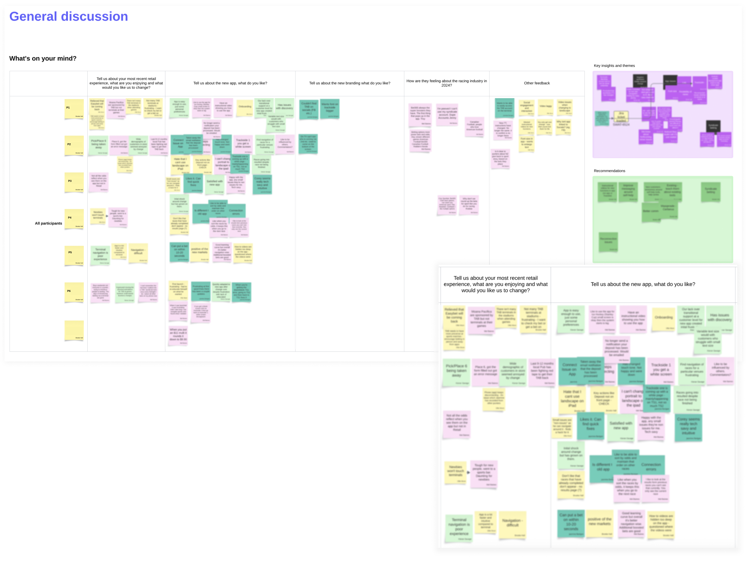
To validate early design concepts for the new Self-Service Terminal (SST) experience, I partnered with the Product and Design team to plan and support a round of rapid guerrilla usability testing. Testing was co-facilitated with 5 internal NZ staff and 14 TAB venue patrons in Auckland using interactive iPad prototypes that simulated SST screens.
Objectives
Gather first impressions of the new terminal design and branding
Assess usability and intuitiveness of key journeys: navigation, betting, depositing funds and ending a session
Identify pain points and improvement opportunities across the Homepage, Today’s Racing, Racecard, Betslip and Deposit flows
Understand how users interact with multi-bet functionality and end-of-session processes (voucher printing and balance withdrawal)
Key questions asked
Homepage
How do customers perceive the design and layout at first glance?
What information do customers expect to see on the Homepage, and how relevant is the content currently displayed?
How easily can customers identify which race an EasyBet refers to?
Adding Funds (Deposit)
How do customers expect to add funds using a credit or debit card?
Where do customers naturally look for the option to deposit funds?
At what point in their betting journey do customers typically add funds to a terminal?
Adding multiple bets to Betslip (Multi)
How do customers expect to place multi bets across different races?
How relevant and useful is the race information displayed when making betting decisions?
What do customers expect to happen when they select options such as “Quaddies and More”?
End Session and Print Voucher
How do customers expect to end their betting session and retrieve their voucher or remaining balance?
What are customers’ perceptions of needing to enter their PIN twice during the process?
How confident do customers feel that their session has ended successfully?

Research briefing to understand the team’s objectives, research questions, hypotheses and discuss proposed methodologies
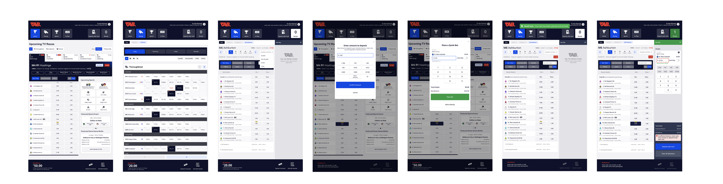
Key screens tested with customers. Designs created by Product Design team.

Example of the note taking and lean synthesis board used during the collaborative synthesis sessions I ran with the team where we recapped our research goals, discussed observations, identified key themes and translated the team’s raw findings into actionable insights and design recommendations
Insights to action
| Top insights |
Key assumptions and hypotheses tested ✅ Validated ❌ Invalidated |
Recommendations to influence next iteration |
|---|---|---|
| 1. Users expect to see ‘$0.00’ as the balance amount as it provides reassurance that there are no funds available in terminal when ending the session | ❌ Users feel confident that they have successfully ended their session after tapping ‘End with voucher’ button | Replace default 'Insert cash' text with ‘$0.00’ amount in balance after funds have been withdrawn |
| 2. ‘Quaddies and More’ button displayed on the racecard was not discoverable or intuitive | ❌ Users understand that tapping ‘Quaddies and More’ will display additional bet types | Review placement of ‘Quaddies and More’ button and label |
| 3. Majority of users didn’t utilise the header buttons to navigate (ie. Home, Racing, Sports) and were not clear what the ‘Show all races’ CTA button does in the secondary navigation level | ❌ Users understand how to navigate to see all races using the ‘Show: All Races’ button as the label is clear | Improve hierarchy, prominence and contrast of header area and buttons. Update ‘Show: All races’ label to be more intuitive and improve comprehension |
| 4. ‘Deposit with card’ CTA was discoverable and intuitive however mixed views on needing to deposit before adding a bet to the betslip vs depositing after bet has been added to betslip |
✅ Users understand how to deposit using a card because the CTAs are clear and discoverable ❌ Users prefer to deposit before placing their bets (preload) as it provides a better experience |
Allow customers the flexibility to add funds at any point in the journey and conduct structured usability testing on physical terminal to gather more comprehensive feedback about end-to-end flows |
| 5. Green success banner message was clearly understood however some users needed to be prompted and mentioned the placement was not the most suitable | ✅ Users understand when certain actions have been performed successfully (eg. depositing funds) as the success messages copy is clear | Review banner message design and placement to ensure critical messages are discoverable and clearly communicated to users. Consider how micro animations can be used to confirm actions. |
Designs iterated by Product Design team


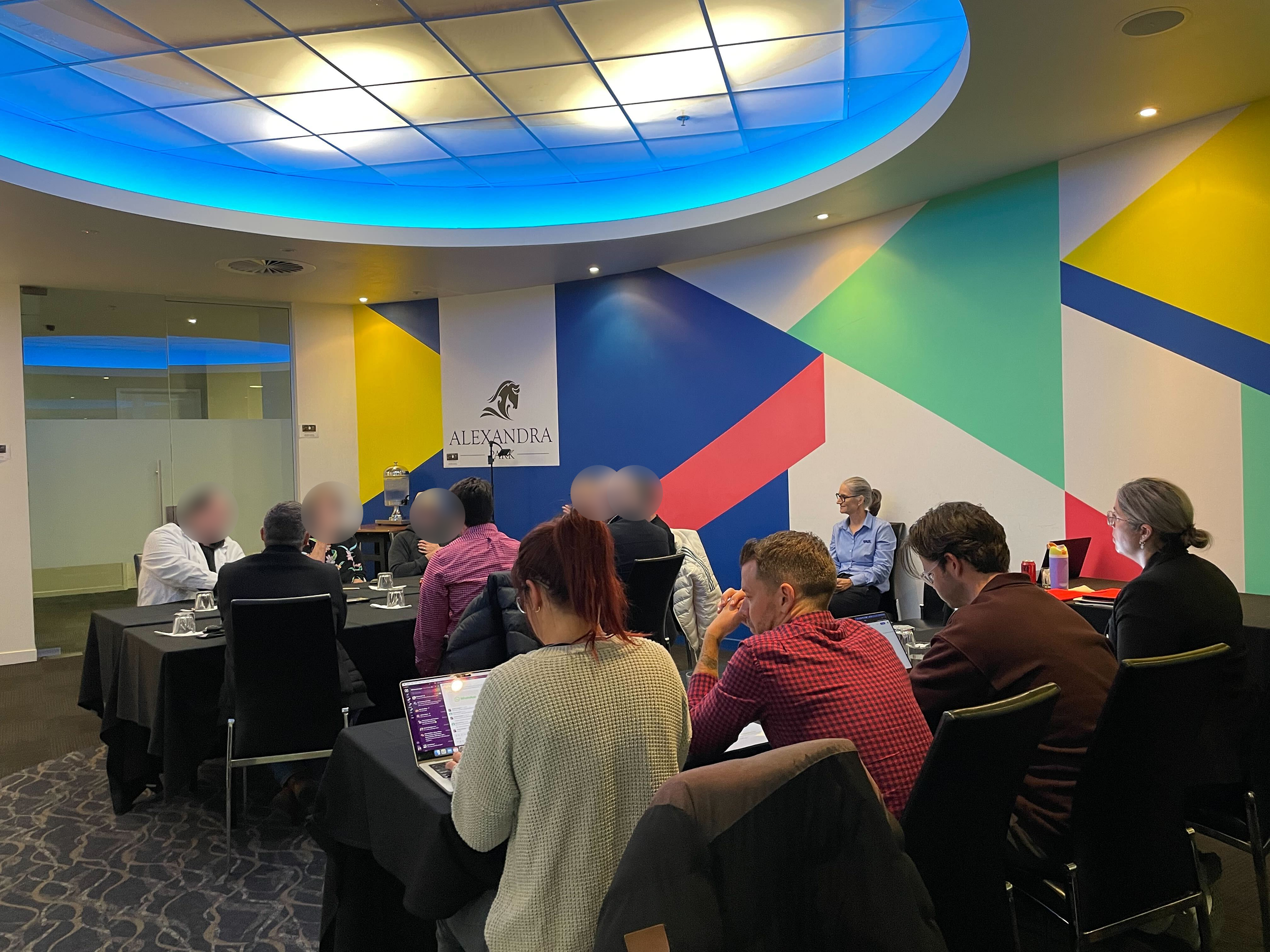
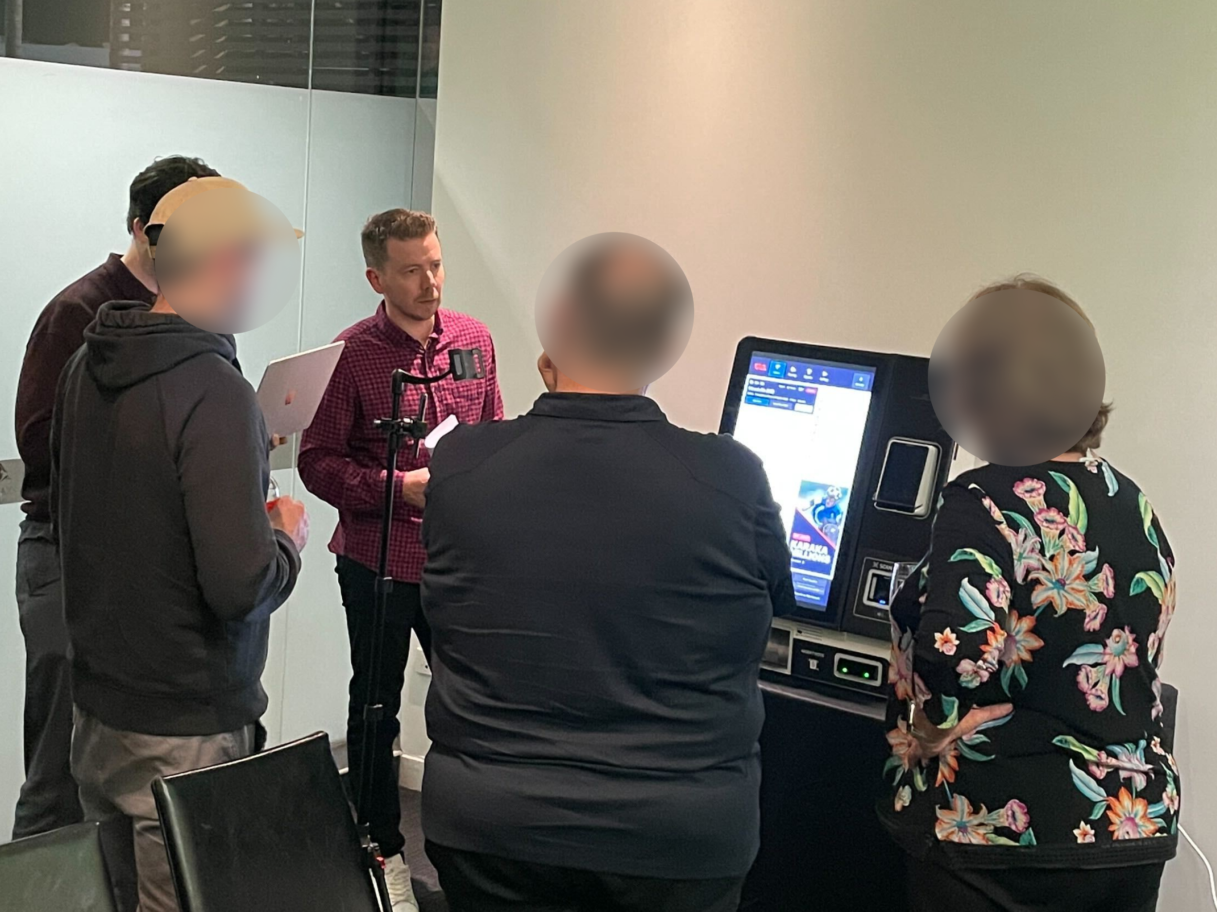
2. Retail Conference, Customer Connect and Guerrilla Testing for Terminals
To validate recent design iterations for the self-service terminal (SST) experience, we conducted a mixed-method study combining guerrilla usability testing, focus groups, and in-venue observation.
A Retail Conference testing forum engaged 40+ retail operators and internal stakeholders, enabling testing in a realistic environment using physical terminals
A Customer Connect focus group with 6 customers provided qualitative insights into user expectations and perceptions of the refreshed design
Guerrilla testing sessions were run with 10+ race-day customers at an Auckland racetrack to gather fast, in-context feedback on updated key flows
Staff expressed a huge amount of excitement during the Retail Conference demonstrations that highlighted the changes that have been made to terminals. Both operators, staff and customers praised how easy and intuitive the terminals are to use, highlighting the importance of conducting iterative testing and listening to customer feedback. These sessions collectively strengthened confidence in the updated design direction and uncovered new usability opportunities grounded in real customer behaviour.
Objectives
Leverage and refine the questions from the previous round of testing to validate design updates implemented
Assess the clarity, discoverability and intuitiveness of key terminal interactions
Identify residual pain points and new opportunities to enhance usability and confidence during transactions
Strengthen stakeholder alignment by testing with a larger, more diverse participant group


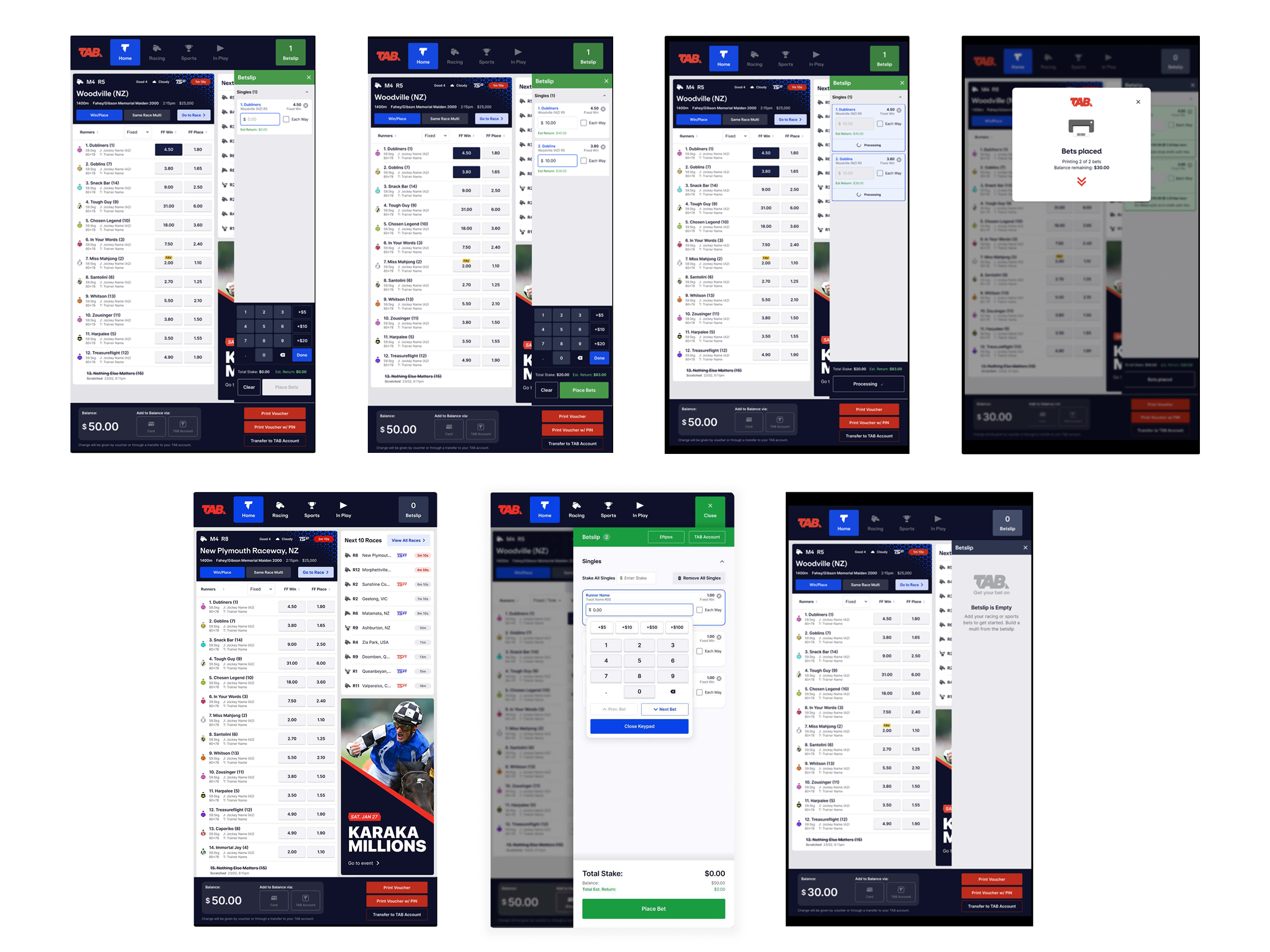
Key screens tested with customers. Designs created by Product Design team.
Example of the note taking and lean synthesis board
Insights to action
| Top insights |
Key assumptions and hypotheses tested ✅ Validated ❌ Invalidated |
Recommendations to influence next iteration |
|---|---|---|
| Initial negative sentiment towards new terminals due to change but eventually were impressed by speed and look + feel of new designs | ✅ Users can easily identify the next race to jump on the Homepage | Proceed with current Homepage design and continue to refine UI |
| Customers prefer the full page betslip design opposed to the side drawer as it allowed runner rows to stretch full width on the racecard. However the full page layout creates separation between elements largely due to the screen size |
❌ Users prefer the side drawer betslip design as it allows them to continue viewing runner odds when adding selections to betslip |
Proceed with full page Betslip design, adjust proximity of inputs and keypad and continue to conduct internal usability testing to gather feedback on iterations |
| Customers experienced accessibility issues such as font being too small and contrast levels which impacted readability | ❌ Users find the information readable and legible due to the font size | Increase font size, spacing and contrast of elements, and consider allowing customers to adjust font size / zoom levels |
| Customers found the updated navigation on the racecard more intuitive and quicker to find more races and bet types (eg. quaddies, meetings) | ✅ Users understand that tapping ‘More Bet Types’ will show additional bet types such as Quaddies, Exacta, Top 2/3/4 etc. | Conduct further usability testing with customers to pressure test Additional Bet Types journeys |
Designs iterated by Product Design team


3. In-venue Ethnographic Research and Interviews for RIDs
The next phase focused on the Retail Information Displays (RIDs) in venues where over 3 days I led an in-depth ethnographic study across 13 TAB venues in Auckland, representing a cross-section of three key venue types — TAB Stores, Club TABs and Pub TABs.
Using the AEIOU framework (Activities, Environment, Interactions, Objects, Users), I observed how customers and staff engaged with Retail Information Displays (RIDs) including odds display screens, eForm screens, terminals and Trackside TV broadcast screens. The study included 40 customer interviews, 6 venue manager interviews and in-situ observations. Research was co-facilitated between the UX and CX teams, with logistics supported by the Retail team in Auckland.
Objectives
Understand the end-to-end customer experience within TAB venues
Explore how customers interact with media screens (RIDs, eForms, Trackside TV, printed form)
Identify pain points and opportunities for improving media usability and accessibility
Validate or challenge existing hypotheses around RID and eForm engagement
Understand venue type differences and their influence on customer behaviour and media needs
Key questions asked
Customers
How do customers expect to choose which TAB venue to visit, and what keeps them coming back?
How do customers typically place a bet when in a venue — what feels easiest or most natural, and why? (eg. over the counter, using a terminal etc.)
How do customers use media displays (eg. odds displays, eForm displays, TV broadcast screens) to help them make a betting decision?
How do customers expect odds display and eForm screens to support them when placing bets?
Venue Managers
What does a normal day look like for you as a venue manager?
What keeps patrons engaged and returning to the venue?
At a high-level, how do patrons generally use the TAB terminals, information screens (RIDs, eForm), TV broadcast screens, mobile devices etc. in a venue?
What’s currently working well and what frustrates customers about media screens?
How do staff support customers using media screens or terminals?


Example of the AEIOU framework (Activities, Environment, Interactions, Objects, Users) used to capture observations in TAB venues
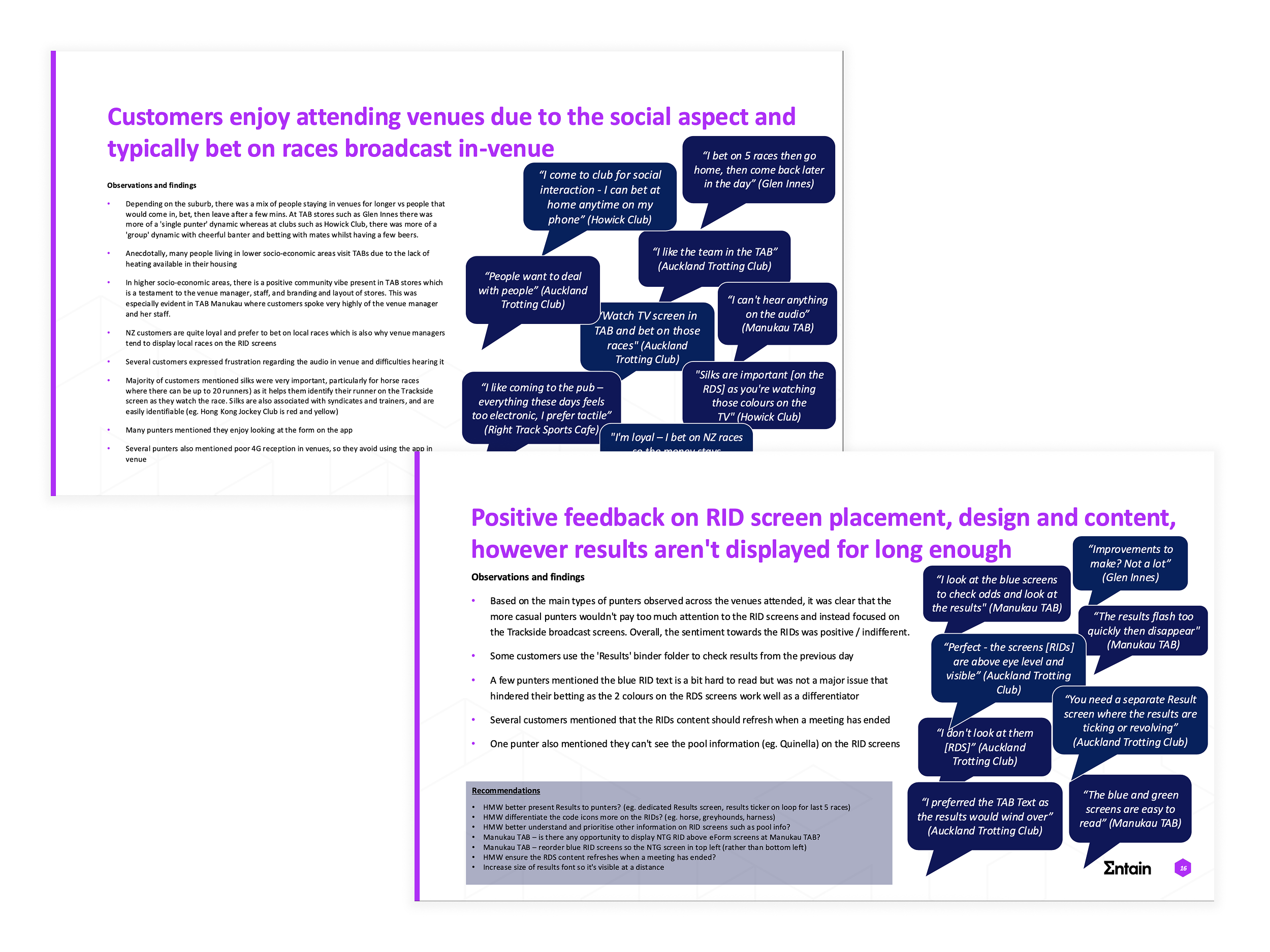
Excerpt from in-depth research report highlighting key insights, observations and recommendations, plus supporting customer verbatim
Insights to action
| Top insights |
Key assumptions and hypotheses tested ✅ Validated ❌ Invalidated |
Recommendations to influence next iteration |
|---|---|---|
| Older patrons are highly change-averse, preferring printed form and over-the-counter (OTC) interactions due to familiarity and accessibility | ✅ Existing customers are change-averse and tend to resist new technology | Introduce guided tutorials and staff-assisted onboarding for eForms/SSTs, and add accessibility features such as font zooming |
| eForm navigation is cumbersome, requiring excessive scrolling with limited ability to switch between races and meetings | ✅ Customers expect to navigate quickly between races from the top of the screen | Simplify navigation with top-level race tabs and sticky navigation to reduce scrolling and decision time |
| Results on RID screens disappear too quickly, forcing customers to rely on eForms during busy period | ✅ Race results are critical to customers and expect the existing information to be presented more effectively | Add dedicated Results screens or Results ticker cycling through the last 5 races |
| Form comments are critical for NTG punters, helping them make informed and timely betting decisions. Form comment example: ‘Slw,5bk,clr last cn,big fin late; Fought hard to score 1215m 11/5. Debut run had real merit. Can go on.' | ✅ Key data such as form comments strongly influence betting confidence and speed | Ensure form comments are retained on eForm screens and displayed for AU races |
4. Odds Display Concept Testing
To validate and refine the new odds display screen concepts the Product Design team had created, I supported the team to conduct in-person qualitative testing at a Wellington TAB venue alongside Product and CX partners. 6 screens were set up behind the venue counter to test high-fidelity prototypes representing new odds, results and upcoming races screens.
The team gathered insights from 5 regular customers and 3 internal stakeholders. Testing focused on readability, visual appeal, content hierarchy and feature comprehension to ensure the new designs addressed customer pain points identified in previous rounds of research.
Objectives
Validate whether the new odds display screen designs improve clarity, readability and usability
Assess if key information (flucs, last 5, trainer, runner stats etc.) supports informed betting decisions
Understand user perceptions of colour coding, split-screen vs single race views, and new results and upcoming races layouts
Identify design improvements to enhance engagement and streamline in-venue betting experiences
Key questions asked
How do customers expect odds screens to present key information so they can make confident betting decisions?
How useful is colour coding (by code: thoroughbred, greyhound, harness) the odds display screens to quickly identify what race to bet on?
How do customers expect race information to be displayed — for example, one race per screen or multiple races at once — to make browsing easier?
How useful is a dedicated results screen to support their betting experience?
How useful is a screen displaying upcoming races to keep customers engaged and informed?
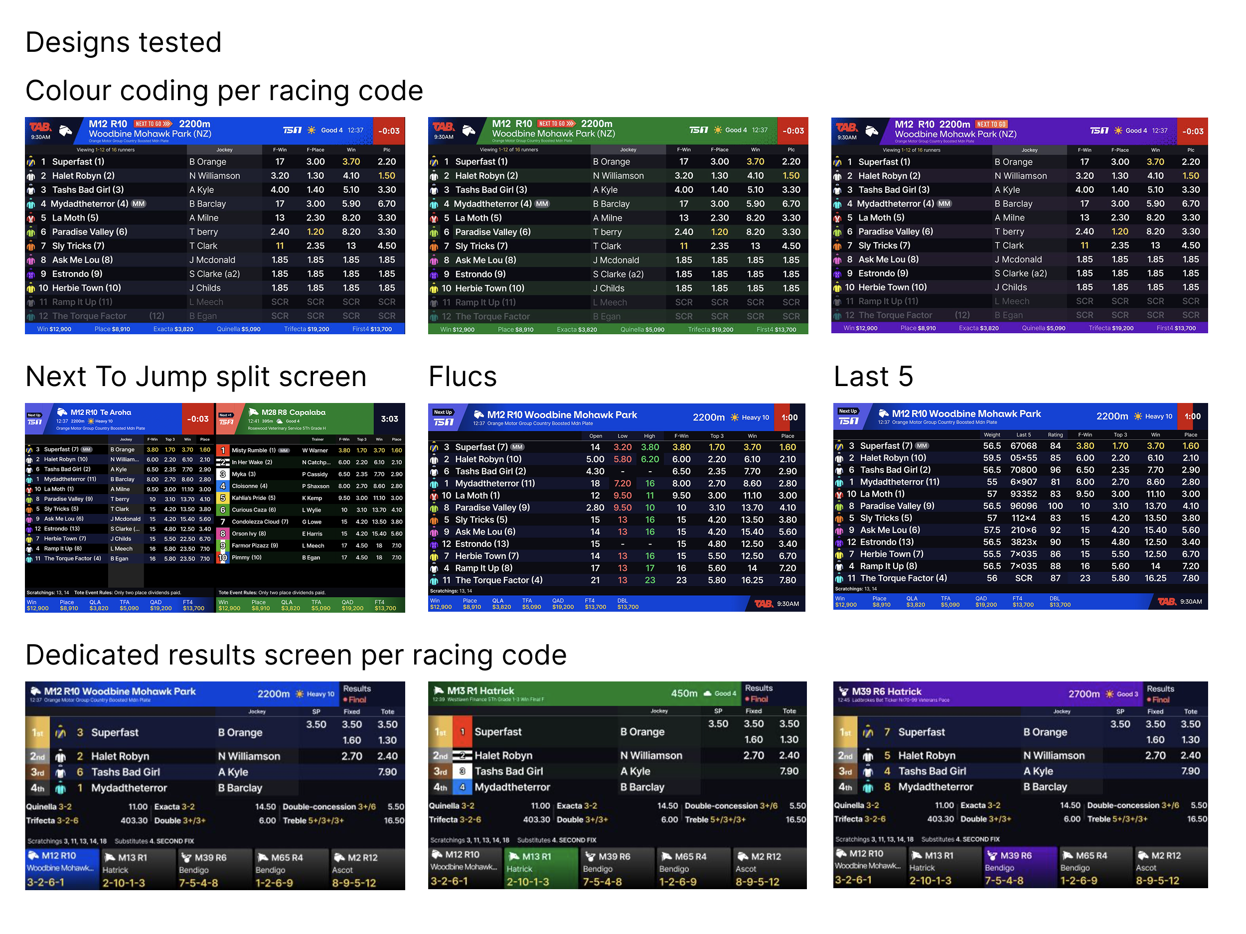
Key screens tested with customers. Designs created by Product Design team.
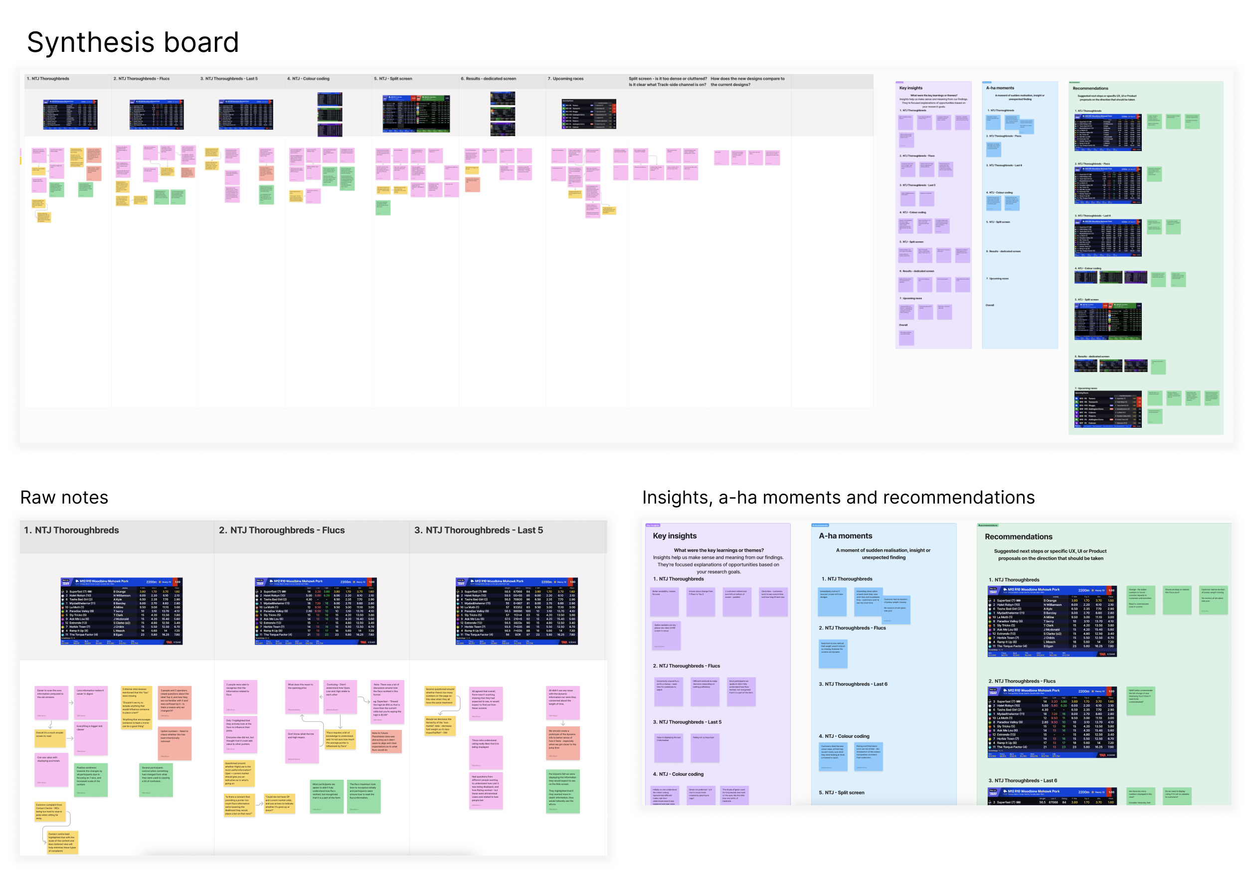
Example of the note taking and lean synthesis board
Insights to action
| Top insights |
Key assumptions and hypotheses tested ✅ Validated ❌ Invalidated |
Recommendations to influence next iteration |
|---|---|---|
| Customers preferred a single race per screen, finding it easier to read and follow compared to split-screen layouts | ✅ Customers find the new RID screen design appealing and useful | Adopt a ‘1 screen per 1 race’ approach to improve focus and legibility |
| Many customers did not fully understand the ‘Flucs’ and ‘Last 5’ columns, leading to confusion during decision-making | ❌ Customers can easily interpret Last 5 data | Revert to the previous design showing up to 3 odds flucs |
| Jockey weight and barrier details, while not immediately mentioned, are critical reference points and should not be removed | ✅ Customers are able to easily make their selections with the information provided on this screen | Conduct a quantitative survey to understand the most important data points customers expect to see on odds display screens to bolster results |
| Dedicated Results screen is highly valuable for quick verification of race outcomes | ✅ Customers find a dedicated Results screen useful and appealing | Implement a dedicated Results screen in venues to provide quick access to race outcomes |
Designs iterated by Product Design team

5. Survey for Odds Display data points
Based on the feedback from the previous round of concept testing, I designed and launched a survey with our NZ customer panel to understand content expectations and critical information needed when placing bets 5 minutes before a race jumps. The study targeted both app users and retail customers to capture cross-channel insights, and received 130 responses.
Objectives
Identify the most important data points customers expect on odds display screens
Determine which information is critical for betting decisions in the 5 minutes before a race starts
Discover any missing data points that could enhance decision-making
Key questions asked
Where do customers typically place their bets — eg. at TAB venues (stores, pubs, clubs) versus TAB digital channels (app, website)
How do different types of information — such as runner comments, last 6 starts, weight, horse condition or market movers — influence their betting decisions when they have limited time before a race starting?
What additional data or information do customers expect to be presented on odds display screens to help them make more informed betting decisions?
Insights to action
| Top insights |
Key assumptions and hypotheses tested ✅ Validated ❌ Invalidated |
Recommendations to influence next iteration |
|---|---|---|
| Customers rely on a specific set of data points when placing bets under time pressure (ie. 5 mins to jump) | ✅ Next-to-jump punters have consistent information needs across digital and retail | Prioritise these key data points on odds display screens and app interfaces to ensure quick, informed decision-making |
| Top 5 most important data points for retail customers: Track conditions, Odds, Jockey, Distance, Barrier | ✅ Information needs are similar across digital and venue experience | Ensure these top 5 data points are prominently displayed and easily scannable |
| Missing data themes include course stats, horse condition, market movers, past performance, tips/comments, track conditions, vision and coverage | Add missing data points to odds display screens and digital channels to reduce information gaps and improve decision confidence |
6. eForm Concept Testing
To validate the most recent design iterations for the eForm screens that incorporated insights from the ethnographic research, I supported the Design team to conduct in-person concept testing to evaluate the redesigned digital form display for racing customers.
Sessions were held in a Wellington TAB venue, with testing conducted with 7 customers on iPads using a prototype of the eForm screen. The research focused on navigation, feature usefulness and overall comprehension of the form.
Objectives
Understand customer behaviour and pain points associated with the current eForm screens
Validate the new eForm design and navigation improvements
Assess the value of new features such as speed maps and gear changes
Identify what information customers prioritise when making betting decisions
Determine if the redesigned form resolves frustrations around difficult navigation
Key questions asked
Can customers easily navigate between races and locate desired meetings?
How do customers interact with new features like speed maps and gear changes?
Do customers find the new layout easier to understand?
Which data points and runner information are most valuable to customers?
Does the new design improve overall satisfaction and efficiency?


Excerpt from raw note taking and synthesis board
Insights to action
| Top insights |
Key assumptions and hypotheses tested ✅ Validated ❌ Invalidated |
Recommendations to influence next iteration |
|---|---|---|
| Customers typically don’t use eForm screens immediately before a race, instead researching races in advance due to the detailed information available | Design for focused research sessions rather than last-minute use; prioritise clarity and speed of access to key data | |
| Customers prefer viewing individual runner information rather than all runners simultaneously | ❌ Customers understand that tapping ‘Full Form’ button will expand the short form for all runners | Allow users to tap on a runner individually to view form, rather than defaulting to the full form |
| High-level information such as jockey, weight, comments, and flucs is most important for betting decisions when viewing eForm | ❌ ‘Overall, Win %, Place %, Rating’ data points are important | Display key data in the collapsed short form view for quick reference, reducing unnecessary clicks |
| The improved race navigation header facilitates quicker navigation | ✅ Customers can easily navigate between races | Proceed with improved race navigation header |
The outcome
Redesigning the terminal and media displays experience for TAB NZ retail venues was an incredibly exciting challenge that allowed me to expand my research expertise by leading a multi-round research program, generating insights that shaped both design and strategic product decisions. This project showcases the importance of understanding customer needs and how thoughtful design can transform customer experiences.
Our strategic use of UX research tools throughout the retail uplift initiative delivered tangible results within the 3 month post-rollout period:
10% increase in terminal bet count
12% increase in digital in-venue sales overall
55% reduction in customer support calls for terminals
Multiple rounds of usability testing revealed navigation pain points that, once resolved, streamlined the overall user experience when interacting with terminals and media displays in retail venues. Surveys identified customer’s preferences regarding important data points when making betting decisions. The in-depth ethnographic study uncovered insights into human behaviour and accessibility concerns, and the importance of observing what other factors influence engagement and behaviour.


The team held a Retail Pilot in an Auckland TAB store in January 2025, where the team was dedicated to ensuring customers were comfortable with the new terminals from day one, with in-store posters, brochures, videos and digital resources available, plus QR code feedback link to allow teams to monitor customer feedback via a dashboard. The team received extremely positive feedback on the new terminal experience and media screen enhancements including:
Customers mentioning how easy the new terminals are to use, even encouraging their friends to use them and showcasing the benefits they provide
The new zoom functionality on the eForm screens was celebrated by customers
The additional runner data and easier race navigation on eForm screens was praised
The dedicated Results screens were a very welcomed addition
New self-service terminals
| Objective | Key benefits |
|---|---|
|
|

Odds display enhancements
| Objective | Key benefits |
|---|---|
|
|

eForm display enhancements
| Objective | Key benefits |
|---|---|
|
|

The result is a future-ready, customer-focused wagering ecosystem for TAB retail venues – delivering speed, flexibility and consistency across all locations, ensuring our venues are well-positioned to serve the needs of our customers now and into the future.
Reflection
This project reinforced the importance of designing for customer confidence, clarity and accessibility, especially in environments like retail wagering where users need to feel secure managing their betting and their funds in a public setting. What worked particularly well was engaging directly with customers in-store, observing them in context and incorporating their feedback directly into design decisions. The in-situ testing of physical terminals and odds display screens allowed us to see how real-world conditions influenced behaviour, uncovering insights that would have been missed in traditional lab settings.
At the same time, we learned the significance of research balancing breadth and depth to ensure robust, quantifiable findings and that interim solutions, such as testing on iPads, introduced interaction limitations that affected the accuracy of several findings. This highlighted the importance of testing on devices that reflect the final experience, however we still proceeded with the interim testing solution and internal guerrilla testing in the spirit of rapid and lightweight testing to gather feedback.
Overall, this project reinforced the value of iterative, human-centred design grounded in real-world insights and empathy.